Sell with Confidence
Read More
Read More
News
7 UNEXPECTED COLOUR SCHEMES THAT LOOK GREAT TOGETHER

Many shades have traditionally been considered enemies on the colour wheel.
Here, we look at a few dazzling – and sometimes unexpected – modern colour schemes that might just change the way you put together your next palette.
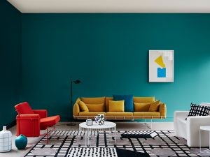
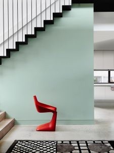
1. Tangerine & aquamarine
Bursting with bohemian summer vibes, this colour combination is an absolute power couple. It works well with both indoor and outdoor spaces and ensures there’s never a dull moment in your home.

2. Highly saturated colours
Go crazy and embrace your colourful side with intense, highly saturated colours. When playing with this colour scheme it’s about ‘the more the merrier’, so don’t hold back, i.e., go ahead and add that hot new fuchsia cushion to your cobalt blue lounge. In saying this, make sure you embrace dark shadows or white negative space to tie your colour palette together.
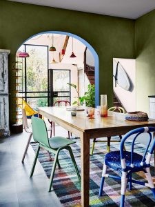
3. Blue & green
Variations of blue and green colour combinations can work surprisingly well together if chosen carefully. For example, cerulean blue works brilliantly with accents of apple green and when worked into white living spaces using accessories and homewares, these tones really liven up the space. You can achieve this look using lush green foliage paired with blue decor, such as bright cobalt blue pottery from your nearest nursery or antique store.
4. Mixed metallics
Often one metallic hue is left on its own against dark hues. Try mixing them together to create the ultimate luxe look. Gold with copper works particularly well.
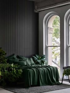
5. Forest green & black
Add a contemporary, mature and unique look to your home using this moody colour combination. Black and deep green is a timeless colour scheme that adds flair to an otherwise monochromatic look, while retaining a dark, lively tone.
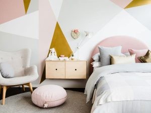
6. Yellow ochre & blush pink
Traditionally quite a natural and dull colour, when yellow ochre is added to blush pink it livens up a room, becoming an enviable addition to an interior colour palette. If you’re looking for the best space to try this combination, a nursery or girl’s bedroom is ideal.
7. Sage green & crimson red
Red and green are traditionally assigned to the festive season, but if you’re brave you can embrace them all year round. Crimson combined with sage green will add a beautiful feminine, regal touch to your home or bedroom. Not convinced enough to try it with paint? You can achieve a similar, less permanent effect with floral displays.
So next time you’re planning to shake up the look of your home, walk the road less travelled and try some of these striking and surprising colour combinations.
Source: realestate.com.au.
Share:
Latest News
EASTER COLORING-IN COMPETITION
🎨🐰 Get ready to unleash your creativity and dive into the Easter spirit with our egg-citing Colouring-in Competition! 🐣🖍️ Calling all young artists from ages 4 to 12! Are you ready to splash some colour and hop into the Easter fun? Ray White Sherwood | Graceville presents an … Read more